Examples
Here are some examples of how to use the data and code provided in this repository, also highlighting how to easily adjust the code to alter the workflow.
Example 1: PCA Plots
In this example, we will create a pca plot using the example dataset.
Recreate Plot in App and Download Code
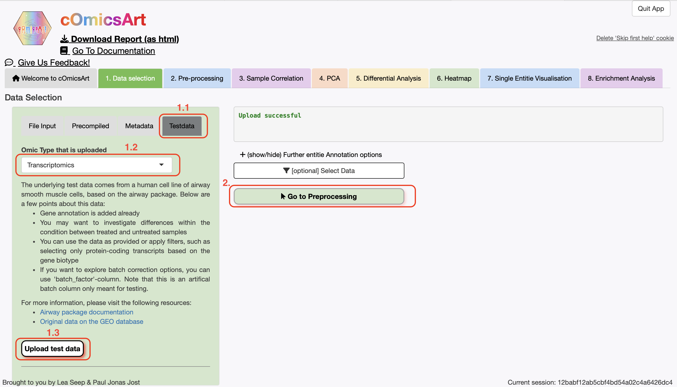
To recreate this example within cOmicsArt, use the following steps:
- Start the Application (locally or online)
- In the
Data Selection, click theTestdata-tab, selectTranscriptomics, and click"Upload test data" - We want to use all the data, so we will not filter the data. Hence, directly click
"Go to Preprocessing" - We want to use
DESeq2as the pre-processing method. Thus chooseOmic-Specificas the Processing Type, verify thatDESeq2is selected as the Preprocessing Option, and click"Get Pre-Preprocessing" - In the
PCA-tab, setPlot Ellispesto No and just click"Get PCA Plot" - Download the data and code by clicking on
Get underlying R code and data
Anything not mentioned here can be left as default. Below you can find a slide show of the steps to follow:
 →
→ Slideshow
Downloaded R Code
If successful, you should have downloaded a folder with the following files (after unzipping):
Code.Rcontains the main code to reproduce the plotData.rdscontains the parameters used in the applicationutil.Rcontains additional functions used in the code.csv-files with the data used in the analysis
As we will change it, the code of Code.R is shown below:
# Load all necessary libraries
library(rstudioapi)
library(SummarizedExperiment)
library(ggplot2)
library(stats)
library(generics)
library(dplyr)
library(grid)


# Define Constants necessary for the script
# Custom theme for ggplot2. Any non ggplot is adjusted to closely match this theme.
CUSTOM_THEME <<- theme_bw(base_size = 15) +  theme(
  axis.title = element_text(size = 15),        # Axis labels
  axis.text = element_text(size = 15),         # Axis tick labels
  legend.text = element_text(size = 15),       # Legend text
  legend.title = element_text(size = 15),      # Legend title
  plot.title = element_text(size = 17, face = 'bold')  # Plot title
)

# --- Load the data and environment ---
# Define the path to the csv- and rds-files. If this fails, set the path manually.
file_path <- rstudioapi::getActiveDocumentContext()$path
file_dir <- dirname(file_path)

# Load the used parameters and utility functions
source(file.path(file_dir, 'util.R'))
envList <- readRDS(file.path(file_dir, 'Data.rds'))
parameters <- envList$par_tmp
data_matrix <- read.csv(file.path(file_dir, 'data_matrix.csv'), row.names = 1)
sample_annotation <- read.csv(file.path(file_dir, 'sample_annotation.csv'), row.names = 1)
row_annotation <- read.csv(file.path(file_dir, 'row_annotation.csv'), row.names = 1)

data_orig <- SummarizedExperiment(
  assays = list(raw = as.matrix(data_matrix)),
  colData = sample_annotation,
  rowData = row_annotation[rownames(data_matrix),,drop=F]
)


# --- Data Selection ---
# Assign variables from parameter list or default values

# Parameters with default values, some might not be used.
selected_samples <- parameters$selected_samples %||% "all"
sample_type <- parameters$sample_type %||% NULL
selected_rows <- parameters$selected_rows %||% "all"
row_type <- parameters$row_type %||% NULL
propensity <- parameters$propensity %||% 1


# tmp_res is used as intermediate as return value is a list
tmp_res <- select_data(
  data = data_orig,
  selected_samples = selected_samples,
  sample_type = sample_type,
  selected_rows = selected_rows,
  row_type = row_type,
  propensity = propensity
)
data <- tmp_res$data
samples_selected <- tmp_res$samples_selected
rows_selected <- tmp_res$rows_selected


# --- Preprocessing ---
# Assign variables from parameter list or default values
omic_type <- parameters$omic_type
preprocessing_procedure <- parameters$preprocessing_procedure
# Parameters with default values, some might not be used.
preprocessing_filtering <- parameters$preprocessing_filtering %||% NULL
deseq_factors <- parameters$deseq_factors %||% NULL
filter_threshold <- parameters$filter_threshold %||% 10
filter_threshold_samplewise <- parameters$filter_threshold_samplewise %||% NULL
filter_samplesize <- parameters$filter_samplesize %||% NULL
limma_intercept <- parameters$limma_intercept %||% NULL
limma_formula <- parameters$limma_formula %||% NULL


res_preprocess <- preprocessing(
  data = data,
  omic_type = omic_type,
  preprocessing_procedure = preprocessing_procedure,
  preprocessing_filtering = preprocessing_filtering,
  deseq_factors = deseq_factors,
  filter_threshold = filter_threshold,
  filter_threshold_samplewise = filter_threshold_samplewise,
  filter_samplesize = filter_samplesize,
  limma_intercept = limma_intercept,
  limma_formula = limma_formula
)
data <- res_preprocess$data

# Assign variables from parameter list or default values
scale_data <- parameters$PCA$scale_data
sample_types <- parameters$PCA$sample_types
sample_selection <- parameters$PCA$sample_selection


pca_res <- get_pca(
  data = data,
  scale_data = scale_data,
  sample_types = sample_types,
  sample_selection = sample_selection
)
pca <- pca_res$pca
pcaData <- pca_res$pcaData
percentVar <- pca_res$percentVar

# Function plot_pca
# Assign variables from parameter list or default values
x_axis <- parameters$PCA$x_axis
y_axis <- parameters$PCA$y_axis
color_by <- parameters$PCA$color_by
title <- parameters$PCA$title
show_loadings <- parameters$PCA$show_loadings
plot_ellipses <- parameters$PCA$plot_ellipses
entitie_anno <- parameters$PCA$entitie_anno
tooltip_var <- parameters$PCA$tooltip_var


# Plot the PCA plot using the principal components chosen in x_axis and y_axis.
# Parameters:
#   pca: PCA object, generated from the data with prcomp
#   pcaData: data.frame, data with the PCA data
#   percentVar: numeric, percentage of variance explained by each PC
#   x_axis: str, name of the column in pcaData to use as x-axis, "PC1" or other PCs
#   y_axis: str, name of the column in pcaData to use as y-axis, "PC2" or other PCs
#   color_by: str, name of the sample data to group the samples by
#   title: str, title of the plot
#   show_loadings: bool, whether to show the loadings on top of the PCA plot
#   entitie_anno: str, what to name the loadings after, part of the rowData
#   tooltip_var: str, name of the column in pcaData to use as tooltip, Only useful
#     when using ggplotly to make the plot interactive. For this wrap the final plot
#     in ggplotly(final_plot).
# Returns:
#   ggplot object, PCA plot

coloring <- prepare_coloring_pca(pcaData, color_by)
color_theme <- coloring$color_theme
pcaData <- coloring$pcaData
if(!is.null(tooltip_var)){
  adj2colname <- gsub(" ",".",tooltip_var)
  pcaData$chosenAnno <- pcaData[,adj2colname]
} else{
  pcaData$chosenAnno <- pcaData$global_ID
}
# Plotting routine
pca_plot <- ggplot(
    pcaData,
    mapping = aes(
      x = pcaData[,x_axis],
      y = pcaData[,y_axis],
      color = pcaData[,color_by],
      label = global_ID,
      global_ID = global_ID,
      chosenAnno = chosenAnno
    )
  ) +
  geom_point(size = 3) +
  pca_ellipses(plot_ellipses) +
  scale_color_manual(
    values = color_theme,
    name = color_by
  ) +
  xlab(paste0(
    names(percentVar[x_axis]),
    ": ",
    round(percentVar[x_axis] * 100, 1),
    "% variance"
  )) +
  ylab(paste0(
    names(percentVar[y_axis]),
    ": ",
    round(percentVar[y_axis] * 100, 1),
    "% variance"
  )) +
  coord_fixed() +
  CUSTOM_THEME +
  theme(aspect.ratio = 1) +
  ggtitle(title) +
  pca_loadings(pca, x_axis, y_axis, show_loadings, entitie_anno, data)
pca_plot
A detailed explanation of the code structure can be found here. We will concentrate on specific parts of the code to understand the workflow and alter it in different ways.
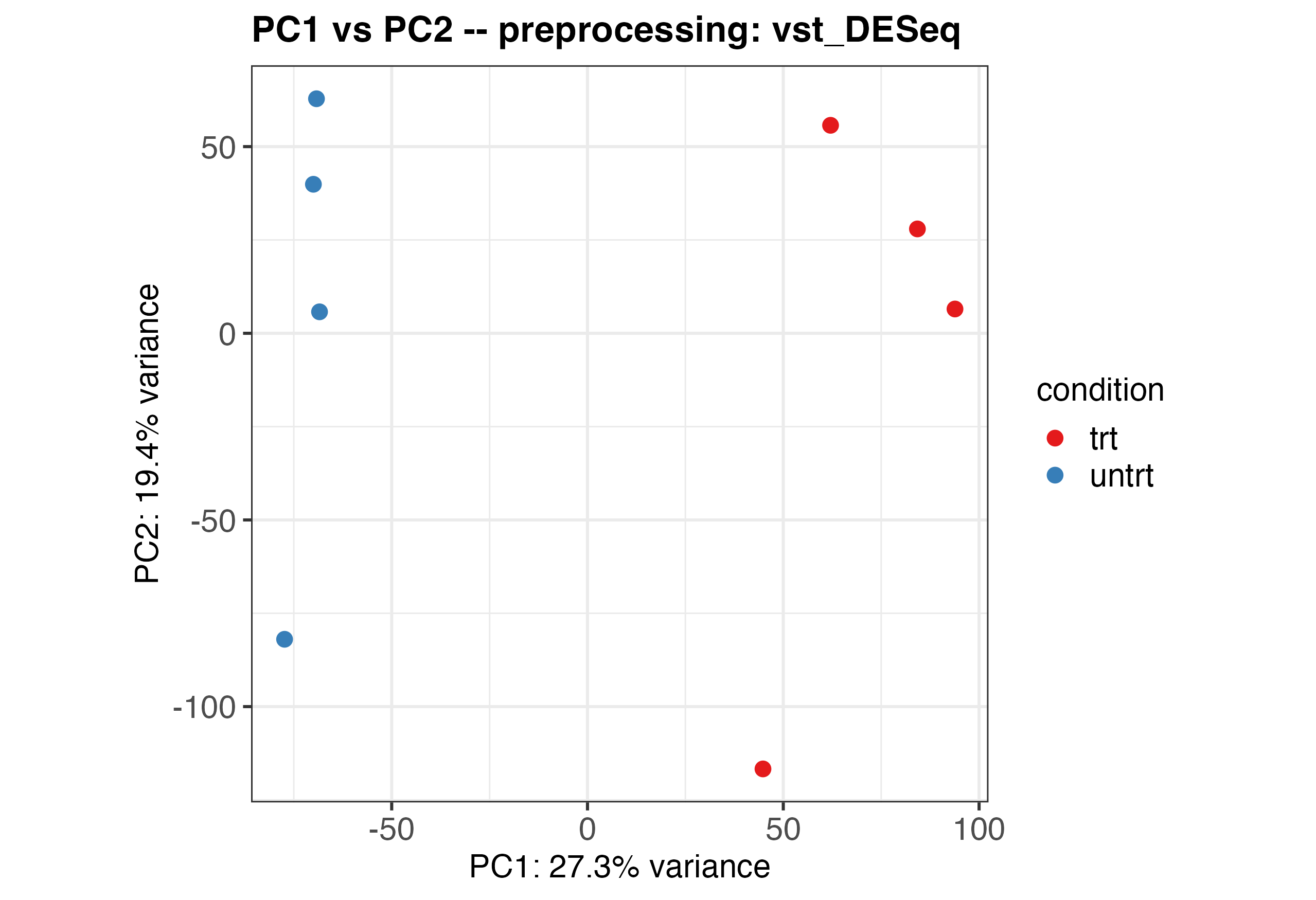
Running the Original Code
Running the unaltered code will produce the following plot:
Altering the Theme
As a first step, we can change the overall theme of the volcano plot. As the volcano plot is created using ggplot2, we can use the theme function to alter the appearance by just replacing the original CUSTOM_THEME object with the altered one. In the code CUSTOM_THEME can be found in lines 13-19. Below you can see the original and altered theme side by side:
Original Theme
# Setting default options
CUSTOM_THEME <- theme_bw(base_size = 15) +
  theme(
    # Axis labels
    axis.title = element_text(size = 15),
    # Axis tick labels
    axis.text = element_text(size = 15),
    # Legend text
    legend.text = element_text(size = 15),
    # Legend title
    legend.title = element_text(size = 15),
    # Plot title
    plot.title = element_text(size = 17, face = 'bold')
  )
Altered Theme
# Setting altered theme options
CUSTOM_THEME <- theme_dark(base_size = 18) +
  theme(
    # Axis labels with italic font
    axis.title = element_text(size = 18, face = 'italic'),
    # Axis tick labels
    axis.text = element_text(size = 15),
    # Legend text
    legend.text = element_text(size = 15),
    # Legend title
    legend.title = element_text(size = 15),
    # Plot title with red color
    plot.title = element_text(size = 17, face = 'bold', color = 'red'),
    # Darker panel background
    panel.background = element_rect(fill = 'gray20')
  )
We can save the plot easily as pdf, png or svg using:
ggsave(
  filename = paste0("pca_plot",".pdf"),
  plot = pca_plot,
  width = 10,
  height = 5
)
The altered pca plot will look like this:

A more extensive list of possible manipulations with ggplot2 can we found in their website.
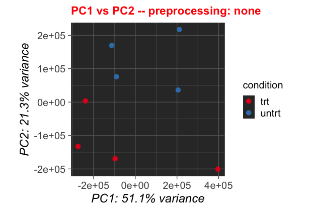
Changes in Analysis
We can also change values for getting the pca. These, as lines 104-106 show are mainly data selection or scaling the data. Thus let us change the scale_data Parameter from its loaded value to FALSE:
Original Parameters
scale_data <- parameters$PCA$scale_data
sample_types <- parameters$PCA$sample_types
sample_selection <- parameters$PCA$sample_selection
After changing the thresholds, the plot will look like this:
Altering the Plotting Code
We can also change parameters for the plotting. They are gathered in lines 122-129. Let us change the show_loadings parameter to show us the loadings, and also color the data by cell instead of condition.
Original Code
x_axis <- parameters$PCA$x_axis
y_axis <- parameters$PCA$y_axis
color_by <- parameters$PCA$color_by
title <- parameters$PCA$title
show_loadings <- parameters$PCA$show_loadings
plot_ellipses <- parameters$PCA$plot_ellipses
entitie_anno <- parameters$PCA$entitie_anno
tooltip_var <- parameters$PCA$tooltip_var
The altered plot will look like a mirrored version of the threshold adjusted plot:

Conclusions
There are of course many more things one can adjust in the plot theme, the threshholds and or the comparison. The code is structured in a way that makes it easy to adjust the code and rerun the analysis. With this example, we showed how to adjust the code to our needs and individualize the workflow.